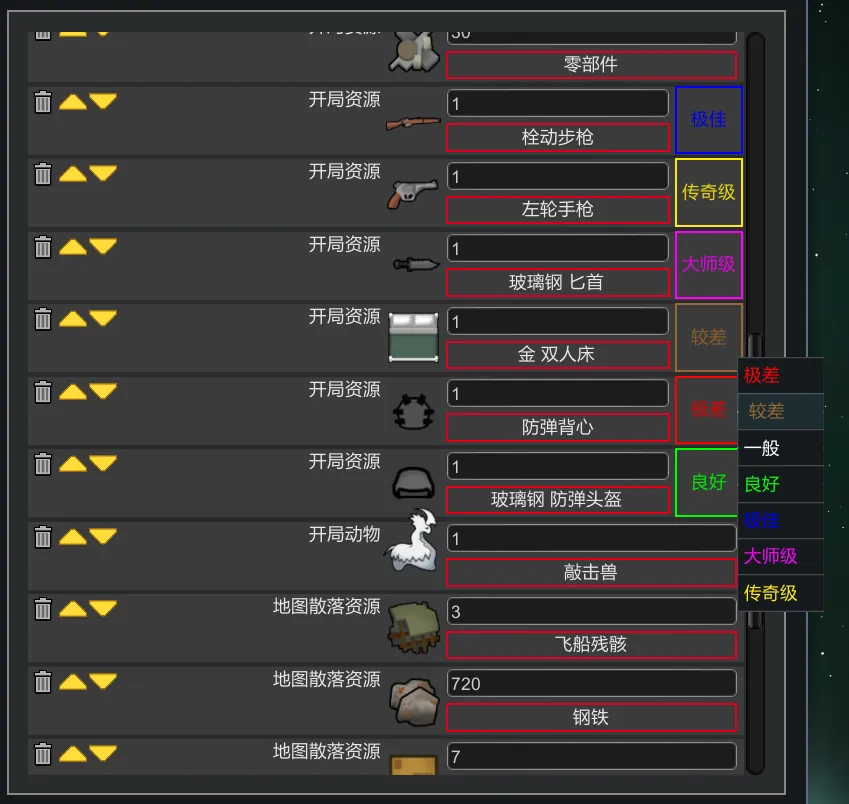
Improved the UI of several floating buttons in the scenario editor.
In the original scenario editor, the list selection buttons were displayed as a floating menu. However, as the number of mods increased, the floating menu would quickly become clunky and crowded, filling up the entire screen. I'm fed up!
I know the Character Editor also has built-in starting items, but not everyone uses that mod, like me.
Changed UI:
- Starting Animals
- Starting Items
- Map Loot
- Starting Research
- Disable/Create Events
- Disable/Create Quests
To Chinese Players
If you also enable
https://steamcommunity.com/sharedfiles/filedetails/?id=3244870513
then the search bar in this mod's GUI can use Pinyin search.
Changelog
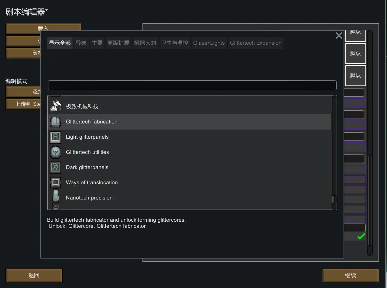
- 25-08-13: There is now a sort button to the right of the search bar, with some preset sorting options.